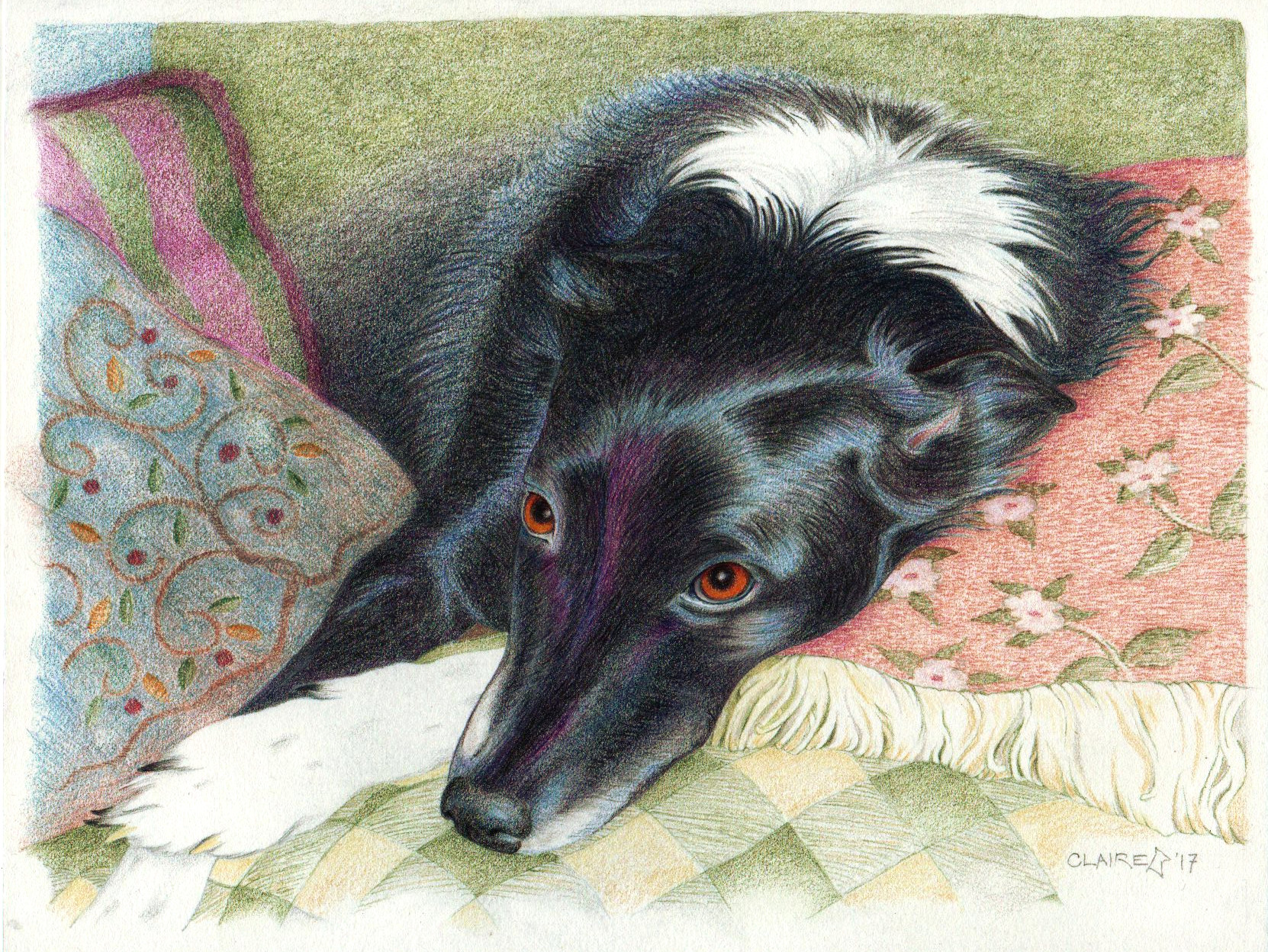
Well, there she is, that black dog I’ve been going on about. Brandy.
I’ve wanted to draw or paint a dog resting on colorful cushions. I have photos of Ava and the late, lamented Robbie to work from, but the project always daunted me.
Then a friend took me up on a longstanding offer to do a portrait of his dog (in thanks for many favors over the years) and when he sent pix, among all the poses of her standing and sitting and roaming his yard, there was this:
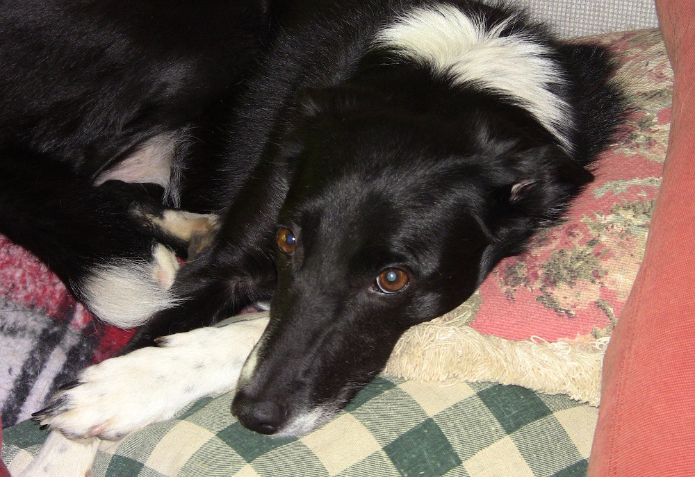
Not only complicated cushions, but (ulp!) a black dog. As I said the other day, black fur is the hardest thing I know how to render, especially in colored pencil. Oh well, might as well take on two challenges at once.
—–
Here’s how I did it. Not the way the book says to. “The book” is Anne DeMille Flood’s Realistic Pet Portraits in Colored Pencil. Of all the art how-to books I own it’s the best-organized and most useful — even if in this case I mostly used it mainly for a few details, inspirtion, and a lot of confidence building.
I figured if I started with key features and got those right, it would give me a morale boost.
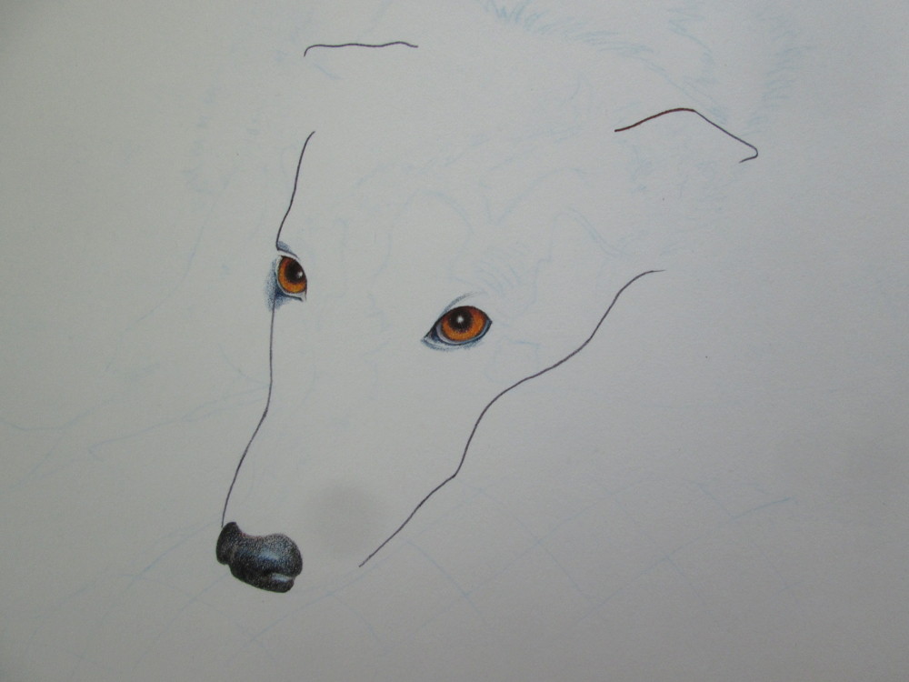
Again, not the kosher way to start, but it got me going.
Next I took a deep breath and moved on to the most difficult part — the modeling of the face, with only various tones of black to define it. I knew the trick to doing vivid blacks with colored pencil: start with black, but then layer. And layer. And layer. Indigo blue. Black grape. More black, pressing harder. Various shades of purple.
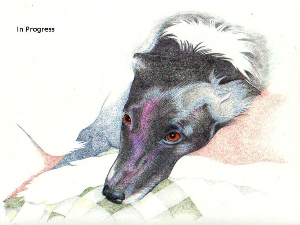
I made a start, but knew that copying the pattern of light and dark from the photograph was misleading me (the muzzle wasn’t turning out muzzle-shaped at all). At this point I sent this in-progress scan to the dogfather to give him a chance to tell me he hated it.
He didn’t. So. Onward.
I decided to try and finish the face to get the most scary bit out of the way. This time I quit looking at the reference photo and “rebuilt” the muzzle according to what I know of dog shapes. Better.

But about now I realized I’d caused myself a problem. You see how the end of Brandy’s tail is drawn in, lapping over her right front leg? When I began, I knew the source photo was problematic because her back legs and belly are all kind of one tangle of undefined shapes and hues, which I couldn’t adequately sort out. So I thought it would be cute to bring only the front elements — face, front legs, and tail tip — into hard focus, leaving everything else vague and fuzzy.
Yeah. Cute idea. But the farther I got, the more I realized that tail was going to give me fits. It had to go. I’d treat Brandy as though she were lying lengthwise, receding into the distance, not all curled up in the foreground.
Unfortunately, colored pencil doesn’t erase well. It covers well, if you overlay it with dark, dense pigment. But that area couldn’t be dark or dense. Even after several tries with different types of erasers, and after deciding to sketch in a new cushion over the misbegotten tail, I was stuck with that darned artifact. At this point, I thought I was in trouble.
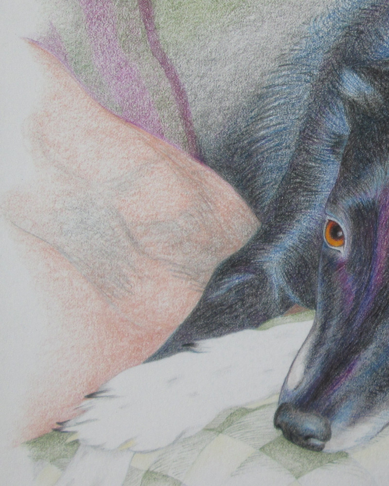
Oh, I knew I could do something to cover those ugly gray scratches. I just didn’t know what or how, so I decided to move on and come back to that later. I finished the face and noodled some other things before coming back to that problematic area.
I did it! At first, as I feared, the problem area became too dark and muddy as I covered — and covered and covered — it. But I used a Secret Artist’s Trick to pick off some of the pigment in that now-blue cushion. While not perfect, not a disaster, either.
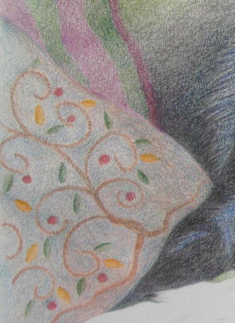
So. On to the final step, the cushion Brandy’s head rests on. Still petrified. And man, what a time this would be to mess up, like a long-distance runner faceplanting 100 meters before the finish line. I decided not to try to render the pattern on the cushion realistically per the photo, but to use the same colors and try to duplicate (roughly) the look of tapestry.
Whew. That worked, too.
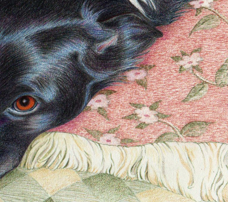
The fringe was the final thing I did. I feared it would be tricky — all those shades of white. It was actually fun and a good example of how you can merely suggest a few details and let the viewer’s eye take it from there.
Annnnnnd — DONE! Other than a few refinements to come, what you see at the top of this blog post is what my friend is going to get. But probably only after I enter it in this year’s county fair. I think this one’s a contender.
Very GOOD!
Nice job, Claire! Brandy is a beautiful dog!
Beautiful! I believe that’s the best work of yours I’ve seen to date.
All your fans are sending dog photos as we speak. (Little Bear, c’mere)… you wanna black dog? I’ll show you a black dog…
Nice work, Claire! Perfect white on the muzzle, and sheen on the hair. And as always, the eyes are very real and alive. (Good work on the pillows, too.)
You should take home a blue ribbon for that painting.
Magnificent. You just wanna reach out and scratch her neck, that fur looks so thick and soft.
Of the various pieces of artwork you have displayed on the blog, this one has got to be the best. Nicely done and a big thank you for posting this.
Well done!
Beautiful!
After a week of seeing only what’s wrong with it (or what might go wrong with it), I must admit it’s good to hear these comments. I love the idea of her being soft and scritchable. 🙂
Absolutely beautiful. The fur is wonderful as others say, and the eyes completely take over the picture. I find it extremely moving, especially if Brandy is no longer alive, which I’m wondering about. I also think your treatment of the pillows was very wise, since they are merely secondary objects.
Shel — You’ll be glad to know (as am I) that Brandy is still very much alive and in the prime of life. And good observation on the pillows. One of the challenges of this composition was making the pillows fancy and varied while still keeping the dog as the dominant image.
VERY nice Claire!
Wow. Gorgeous. Pat is right: should win a blue ribbon.
Wasn’t aware colored pencils could do that, to tell the truth. Most impressive, and thanks for describing the process.
Now, if only I can catch a good pic of our black cat…
😉
I would not have believed that picture could be done with colored pencils! Amazing, and beautiful.
Though I’m no art critic, I have to believe it’s above county fair fare. What’s really amazing to me as I think about it is how remarkably quickly your results keep improving dramatically and how you figure out a technique to use when the “book” solution won’t suffice. At some point your work will have to stop improving by leaps and bounds but there’s certainly no sign of that yet.
ML — I don’t know when colored pencil became a respectable painting medium. Fairly recently, I think. It takes a lot of time to get it to make vivid effects, but some people do amazing work with it.
Shel — I was going to say that one reason for the big improvement was simply that the latest pieces took 20-30 hours, when the early ones were 2-3 hours. But you inspired me to look back … and yeah. That felt good to see. Of course you’re also right that the leaps and bounds will eventually get smaller, but right now it’s pretty exhilarating.
And as to blue ribbons, given that the fair hands out ribbons on the very generous Danish system, a blue ribbon is a given. I’m shooting for best in its class and would love to beat out the guy who usually wins Grand Champion.
Wow. Wow. Wow. I can’t draw a stick figure but I do know when a piece of art is fabulous!! Thank you for sharing!
Well done.
Brandy is a beautiful dog!